
The aesthetics of colour are a magnetic topic. Some people seem to have a sixth sense for colour. Others seem to have no idea why a red wall is a big NO.

Yet, everyone responds to colour. So if you fall into the second category or you would like to master some colour techniques, this article will help you become a fearless colour juggler.
Think of the Mood You Want to Create
When it comes to decorating your bedroom, colour plays an important role. Although, it may be somewhat daunting if you are not an interior designer or colour expert.
An excellent place to start is to ask yourself questions such as:
- What is the mood that I am would like to achieve?
- Who uses the space?
- What activities take place in the room?
- What is the orientation and shape of the room?
- What form of light within the space?
- What time of the day is the room used?
As soon as you have your answers, here`s where colour psychology comes into play.
Colour and emotions are closely linked. Warm colours can evoke different emotions, while cool colours and bright colours can create a different feeling than muted colours.
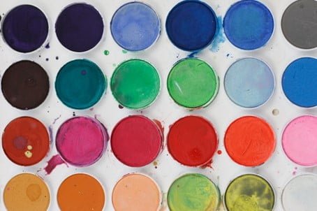
Colours can make us feel happy or sad, anxious or relaxed. Think of how you`d like to feel in your bedroom. Start by choosing a colour from the following. Then I will show you how to work your way around it further in this article.
Orange: refreshing, energetic, and creative.
If this is the mood you are after, I am not suggesting painting all your walls in burnt orange. It would help if you created a colour scheme where orange plays its part and use it in a complementary, analogous, or triadic palette, as you will later learn in this blog. You can then use it just as an accent colour, for example, in your throw pillows.
Purple: vibrant, royalty, spirituality.
The colour purple can sometimes feel overwhelming. However, purple could act as an accent colour rather than a backdrop.
Blue: peace, calm, serenity.
Blue is the shade of the sky and clear seas, and it will trigger a sense of tranquillity and help you achieve a calm state of mind. Make sure you select a warmer shade if you want to stay upbeat.
Yellow: Optimism, happiness, energy.
Just make sure you use it sparingly, as it might come across as alarming in some colour combinations.

Red: Urgency, passion, excitement.
Try to use it strategically as on the side of the positive emotions, and red can also trigger feelings such as anger, frustration, and even hunger. Ever wondered why McDonald`s predominant brand colour is red? There you have it.
Brown: Nature, simplicity, honesty.
Many people perceive brown as being grounded, soothing, and organised. Make sure you use warmer shades instead of duller hues.
Green: Vitality, life, regeneration.
Every shade of green can evoke a completely different feeling, but green is a great colour to pick if you want to feel closer to nature.
Ever considered a forest green upholstered bed to infuse a fresh feeling of escapism in your sleeping sanctuary?
Pink: peace, compassion, love.
Pink is also the colour of feminity and nurturing. Darker hues can signify passion and energy, while lighter tones can be more tranquil.
Refer to a Colour Wheel
As we learned earlier, colour can be the key to entirely changing the mood in a space.
So besides being aware of the emotions that the colour can trigger, you also need to master your colour wheel.
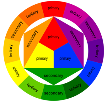
The colour wheel will introduce you to the primary colours (red, blue, yellow), the secondary colours (orange, green, purple), and the tertiary colours (a mixture of primary and secondary colours).
Using these, you can then start creating different colour schemes.
- Achromatic
These colour harmonies present little to no colour saturation: white, black, grey
- Accented Achromatic
An achromatic colour scheme with only one tone of one colour added.
- Monochromatic
Derived from a single base hue and extended using its shades, tones, and tints.
- Analogous
Uses any 2 to 4 colours that appear next to each other in the colour wheel, resulting in a colourful and often soothing palette.
- Accented Analogous
Adds the complementary colour opposite the centre analogous one.

- Complementary
Two opposing colours on the colour wheel act together to create a dramatic, bold, and high-energy colour scheme.
- Split Complementary
A variation of the complementary colour scheme, split complementary, is the primary colour, and instead of its complement, it uses its two adjacent colours.
- Clash
Clash uses two colours, with one of them sitting to the left or right of its complement. The result can be creative and unusual.
- Tetrad
Tetrad is a scheme made up of 4 equally spaced colours around the colour wheel.
- Triadic
Triadic uses three colours located at equal distances from each other in the colour wheel.
Pay Attention to the Colour Undertone and Temperature
Ever wondered why some colour schemes work while others don`t? The reason for this is choosing colours with conflicting undertones.
The undertone is the effect of the additional colour mixed with it. For example, If you are trying to find the undertone for a red, compare it to a true red. This will give you an idea of whether your red has a more yellow or violet undertone.

Equally important is the colour temperature. Colour temperature can be described as warm or cool. The warm colours are red, yellow, and orange, while the cool colours are blue, green, and violet.
Regardless of the group that a colour falls into, each colour can be a warm or a cool variation.
If the colour has more blue, green, or violet in it, that will make it a cooler version. And you get the idea.
You need to be aware of this before picking your colour palette, as a particular colour temperature can completely change a space.
Warm colours advance, making objects appear more prominent, but they can make a room feel smaller and cosier.
Cool colours recede, making objects appear smaller, but they can make a room feel bigger and brighter.
Don`t Neglect the Light in the space
Colour interacts with all the other elements of design. The most crucial relationship that comes into play is the interaction of light and colour.
How the eye perceives the colour is an effect of how a given surface reflects the light. Without light, colour doesn`t exist.
The colours you use in your space will be affected by both the orientation of the room and the amount of natural light it receives and by artificial lighting.
So, according to the type of light in your bedroom, bluish or greenish colours will make the room seem shadier, while red, yellow, and orange colours will balance it out and make it lighter.
Final Tips on How to Achieve a Harmonious Colour Scheme
- Select colours that have common characteristics: chroma, colour temperature, undertone
- Don`t forget about your non-colours and neutrals: black, white, grey. They play a supporting role that completes any colour scheme.
- Consider the percentage of colours used: Dominant, Sub-Dominant, Accent.
- Create interest with contrasting colours.
- Think about the type of light your space will benefit from, for example, ambient, natural, accent.
- Samples first! – You can buy any colour paint in sample size and paint a small area first or take a fabric swatch home and try to visualise how a pink upholstered bed would look like in your bedroom light.
Final Thoughts
Before the design choices, there are practical and logical reasons to make specific selections.